Designing a brand
Find a visual vocabulary for your brand. Compare materials and techniques before you commit to a direction.
A visual reference atlas · Philipp Rückert
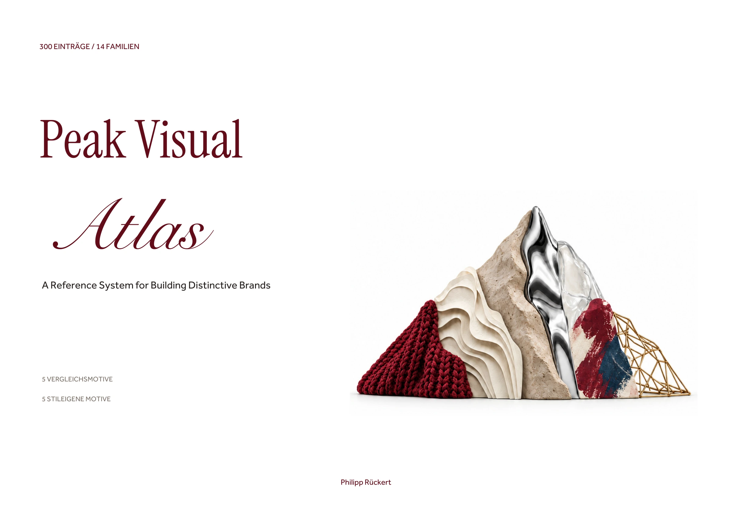
A Reference System for Building Distinctive Brands
Find the visual language that fits your brand.
From typography and illustration to knit, glass and digital imagery: this atlas gives you concrete images and names for what your brand should express – in branding, web design and motion design.
Digital reference edition · Explanations in German
The idea behind it
At the top, portrait, product, type, house and landscape stay the same. Below, five well-chosen motifs show what each visual language does especially well. That way you compare the expression and discover new possibilities at the same time.
Each style has one page: style name, family name, a short German explanation and ten images in a 2×5 grid. The 14 chapters lead from geometry and typography through materials and craft to digital and temporal visual worlds.
Eight real pages from the book
Switch the style or compare two pages side by side. The five comparison motifs in the top row always stay in the same place. The bottom row varies to suit the style.
Click the image to enlarge the page.
The images were created with AI for this edition. They are editorial style interpretations. Movement styles are shown as sequences or traces.
From an idea to a shared reference
Find a visual vocabulary for your brand. Compare materials and techniques before you commit to a direction.
Use concrete style names and image examples when talking with designers, teams and providers. That turns “somehow premium” into a visible direction.
Give an AI a recognizable reference for the visual language you want. The atlas helps with the selection; you judge the result against your brand and the examples.
The complete index
14 families organize historical styles, materials, techniques and cultural imagery. Search by name or characteristic. You can view eight complete pages directly.
300 entries
An asymmetric grid, a matter-of-fact grotesque typeface and precise image-text relationships organize information. Swiss and International Typographic Style are historical synonyms; here the focus is on poster composition.
International Typographic Style also refers to Swiss Style. This second register entry shows its transfer to connected information and identity systems.
Contemporary Swiss interpretations combine grid discipline with variable type, unexpected scales and digital composition tools.
A visible or implied grid determines the position, size and rhythm of all elements in a composition.
Circle, square and triangle combine with constructed lettering and high-contrast areas into a functional visual order.
Horizontal and vertical relationships structure separate areas of color. Primary colors and neutral fields create an asymmetric balance.
Diagonals, photomontage and strong jumps in scale align type and image into one shared visual movement.
Systematic order, reduced form and traceable information hierarchies link design with use and production.
Restrained forms, logical proportions and sparing means make the structure of a design easy to follow.
Circles, rectangles and triangles carry the composition. Their proportions and relationships replace free decoration.
Reusable shape components form a flexible system. Changing combinations stay connected through shared proportions.
Functional hierarchy, asymmetric typesetting and photography dissolve traditional symmetric book and poster layouts.
Form and hierarchy follow use. A few visual means make content, operation and orientation easy to grasp.
Consistent signs, grids and typography create corporate communication that stays consistent across many applications.
Constructivist devices are recombined in a contemporary way: directed geometry, strong contrasts and typographic tension.
Floating basic shapes, few colors and asymmetric tension shape the composition. The comparison images are reduced here to geometric signs.
Sharply bounded areas of color meet without painterly transitions. Edges and proportions determine the effect.
Uneven columns, offset axes and deliberate empty space create balance without a mirrored layout.
Uniform cells divide the surface into repeatable units. Content can assemble different formats from them.
One dominant axis organizes type, shapes and spacing. Shifts stay aligned to this constructive reference line.
Geometric signs and hard surfaces are used as a deliberately artificial, often quotation-like image system.
Few elements follow clear rules for spacing, repetition and variation. The reduction comes from the system.
A few type sizes, deliberate white space and precise typesetting make typography the main carrier of the design.
Very large type becomes the image surface. Bleed and scale put individual words or letters on physical display.
Good to know
For entrepreneurs, brand managers, designers and people who design with AI. You don't need design training to compare visual languages and name a direction.
325 landscape A4 pages with 300 styles in 14 families. Each style shows five fixed comparison motifs and five style-specific motifs on one page: 3,000 image examples in total, plus introduction, chapter openers and index.
Yes. These are purpose-made style interpretations. They show visual possibilities and do not claim real handcrafted production or scientific photography.
The visual edition focuses on style names, short explanations and images. These references help you choose a direction and communicate it clearly.
From Grid to Chaos explores design languages through collected references. Peak Visual Atlas uses purpose-made interpretations and a fixed 5+5 grid. The entries range from historical styles to materials, techniques and cultural imagery.
As a finished digital reference edition with 325 pages. Here you can see eight complete book pages and the entire style index. For questions about the book, you can contact Peak Atlas.
Peak Visual Atlas · Philipp Rückert
Sign in with Google, build your atlas in about two minutes and see your company in one place.
Free plan · Sign in with Google · set up in about two minutes